
COPY TYPEFACE
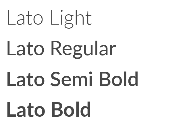
The typeface used for paragraphs and general copy is Lato. Lato is a universally available font that is easy to read and readily available in the following weights: Light, Regular, Italic, Medium, Bold, Semi Bold Heavy and Black. For general copy use, make sure to use the Regular typeface. When emphasizing a call to action, you can use Medium, Semi Bold, Bold or Heavy. Do not stretch, squash or in other ways distort the Lato font… use it as it was designed.
If Lato is not available when using online marketing tools, a secondary font to use is Open Sans.
HEADER & H1 TYPEFACE
When creating a headline or H1 header, the Quattrocento typeface is used. This serif font works well with Lato and should only be used when creating headlines and titles within your marketing.
The Quattrocento typeface is available on the Google Font library. You can download the font directly and import to most design platforms.

SECONDARY & H2 TYPEFACE
When a secondary or H2 typeface is needed, using the Professor typeface can be used sparingly to create a casual and personable connection with your audience.
The Professor typeface is available on the Adobe Font library.

