

Watercolor is a deeply magical medium, prodding us to dance with its inconsistencies.
Sometimes, it begs us to stop painting periodically and pay attention to what's in front of us and within us. It gifts us with its transparent veils of color - as mystical as color can get.
In this class we'll heed the call of our intuition and follow the lead of our materials to uncover the effortless magic of our art.
We'll tap into the flow before us, and we'll add new tricks to our toolkit to direct that flow and be directed by it in return.
We'll return to the land of landscape, but turn inward at the fork in the road. We'll learn to navigate the signposts within our painting, use references in radically re-thought ways, and we'll open up to series, iterations, attempts and studies as precious and authentic expressions and artistic statements in their own right.
Have free-flowing fun, re-think working and art workflows, start to deeply understand watercolor - and come away ready to shout this one truth from the rooftops: You deserve your best art to feel absurdly easy for you - at least some of the time!
“Watercolor speaks - we’ll learn to hear it.”
Classroom Is Open!
Only $67.00
{ LIFETIME ACCESS & DOWNLOADABLE VIDEOS }
Here's a description of each of our special projects:
Warm-up - A FLOW STATE SAMPLER
We'll start with a splash - I'll demonstrate the techniques for building a solid foundation in watercolor basics, as well as a bouquet of special and versatile effects. Follow along and create your own set of watercolor reference cards, so you'll be able to pick textures as effectively as you pick colors in all that you create!


Lesson 1 - JOURNAL BY DESIGN
Now that making texture is second nature, It's really important to spend some time learning, testing, and exploring the world of composition and design a little deeper.
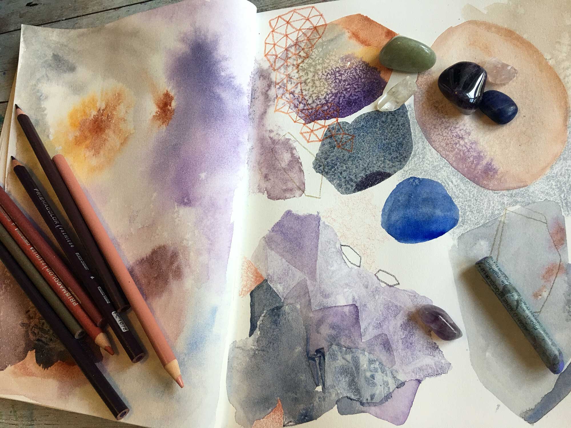
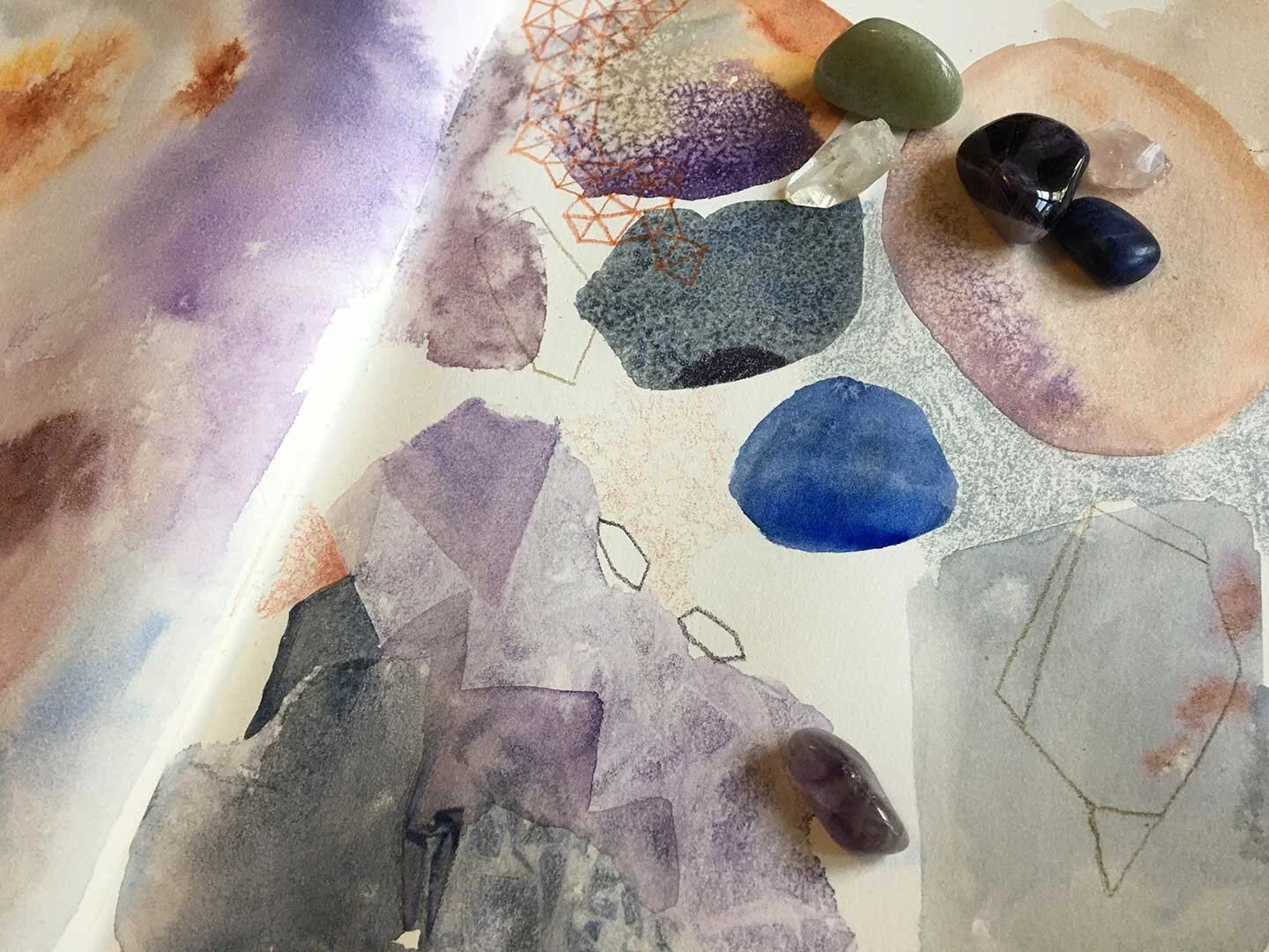
Sometimes these topics can feel a little dry - not here! We'll keep the speed and flow going in our journals, sketchbooks, or on student papers. Taking inspiration from gemstones and crystals, we'll create pages suffused with calming energies and even more calming composition!
The work we do in this lesson will feed the next series we create and strengthen every other kind of art we might wind up making. Since this topic is so important it's important to make it fun and streamlined.
lesson 2 - WINTER DREAMS
We'll explore some of our new texture making skills in creating a series: make one but preferably more of these enchanting and fun winter wonderlands!
We'll train our hands to work quickly and our eyes to work slowly and explore the benefits of working serially, along with tips to get from one piece to the next with flow and confidence.
Lesson 3 - THE LIGHTHOUSE VARIATIONS
How can we use references to impart a focus to totally abstract work, yet free ourselves from the specifics of an inspiring place? How do we "flatten out" again and get away from landscape (if we want?)
Maybe there's a place you love that pretty much everyone loves. Can we paint the familiar in ways that go deeper? Follow along as I use the well-loved Split Rock lighthouse as a point of departure and create mixed media works using our strategies of abstraction, pacing, and now adding intensive attention to color. You can paint along - or use these same strategies applied to any place that you love and have a photo reference for. Again, I’ll be working in a series - you don’t have to, but it is strongly encouraged.

Bonus lesson - Color Unlocked
Color for the watercolorist is an endlessly deep topic - but I'm going to share my take on it. I'll talk about what's in my mixing palette, what isn't and why, how I've re-imagined swatching, and what single piece of conventional advice I think we need to ignore forever. You'll come away with the knowledge you need for a solid and all-dimensional student mixing palette, and a new fearlessness and confidence in palette building.

Classroom Is Open!
Only $67.00
{ LIFETIME ACCESS & DOWNLOADABLE VIDEOS }
Who is this class for?
This class is for the curious and diligent, the confused and underconfident, the minimalist-wannabee, the abstract aware, the landscape lover, and the seeker of de-stressors.
The things that separate a frustrating mess on a page from a confident and beautiful abstract painting are not so difficult to learn, but they can be elusive - this class exists to fix that!
This class is for anyone who sees the beauty of fluid abstract art and wants in.
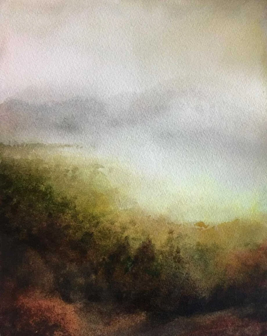
HERE ARE JUST A FEW EXAMPLES OF Dena's WORK


Classroom Is Open!
Only $67.00
{ LIFETIME ACCESS & DOWNLOADABLE VIDEOS }
Supply List
Color is subjective and you should always use and mix the ones that speak to you. I’ll cover the materials I use in the lessons, but also some swap-out options, and I’ll mark items I don’t consider good mixing palette basics as optional in this list.
WATERCOLOR
I like M Graham for in-studio use and Rembrandt for squeezing into pans. Colors Used:
Manganese Blue Hue or Pthalo Blue Green Shade
Dioxazine Violet
Ultramarine Blue
Nickel Azo Yellow or Azo Yellow (M Graham’s is the nicest, great primary yellow)
Pthalo Green Blue Shade
Pyrrol Scarlet or Pyrrol Orange or Benzimidazolone Orange
Yellow Ochre
Terra Rosa (M Graham) or Burnt Sienna (Daniel Smith)
Titanium Buff (Daniel Smith, optional)
Payne’s Gray (optional)
Perylene Green (optional, Daniel Smith, I LOVE it for landscape shadows)
PAPER
Arches Watercolor Pads - Single sheets of 9x12 cold press 140 pound cotton Premier paper.
Strathmore Mixed Media 500 series
I HIGHLY recommend single sheets of 9x12 cold press cotton paper for the “series” lessons, Winter Dreams and Lighthouse Variations. A 12 sheet Arches gummed edge pad (rather than a block) is great for this class - the two “series” lessons are best with 4 sheets dedicated to each lesson. A great alternative is to cut down full size sheets of watercolor paper, sold in 22x30 sheets, so you have as many 9x12’s as each sheet will yield. This can be quite cost-effective. Blick makes a really good cotton cold press 140 pound paper called “Premier” in sheets and in blocks. Your results will always be best on cotton paper when painting in this water intensive way. For the journaling section and for watercolor sketching and journaling I have two recommendations if you don’t want to continue using cotton 9x12’s: The Strathmore Mixed Media 500 series is a cotton paper that lacks watercolor sizing, but will give smooth blends, transitions and behaviors for watercolor and inks. I like the softcover journal because it will stay open, and I like the Visual spiral bound version for the same reason (also it is a very good price for cotton paper!)
My best experiences with non-cotton papers have been with Canson Montval, so I like and recommend the Artist Series spiral bound book. For our “flash cards” I used Canson XL watercolor. XL is a student paper and a sketch-test paper I use a ton. These papers aren’t “bad” though you might hear that a lot - they just don’t really give the best result for layered and water-intensive work, which is what we’re doing in the lessons.
SUPPORTS AND TAPES
BRUSHES
Princeton 4050 “heritage” synthetics are a good lower-cost option I like Trekell Onyx given the choice.
Hake or Mottler Brush: size 16 or 20 round, size 6 or 8 round
Liner brush/detail brush for watercolor
½ inch wash (square edge) brush for watercolor
A usable but not expensive/precious no 2 round brush (doesn’t have to be watercolor.)
GOUACHE
Zinc White or Titanium White you can use acrylic, just be SURE you don’t use your watercolor brushes with it
THE FUN STUFF
(it gets used a lot in this class, if you have trouble getting gum arabic or masking fluid don’t stress it, though):
Pebeo Masking Fluid (the blue stuff)
Bar Soap
Fluid Gum Arabic (I used Da Vinci)
Spray Bottles
Paper Towels
Sponge
Rubbing Alcohol
Eyedropper/Pipette
Ratty Stiff Brush
Toothbrush (decommissioned)
OPTIONAL
MIXED MEDIA
Colored pencil or watercolor pencils to coordinate with your art. (I have a set of Lyra Aquarells - they’re all right, any water-soluble or regular will do, but I like the flexibility of water-soluble. Other water solubles I like are inktense, Caran D’Ache, and Albrecht Durer. For a budget regular colored pencil, Progresso woodless by Koh I Noor are nice!)
Caran D’ache Neocolor 2 in white, cinnamon and silver-gray. Choose colors that complement your work, and have fun with them - but I find white ALWAYS helpful.